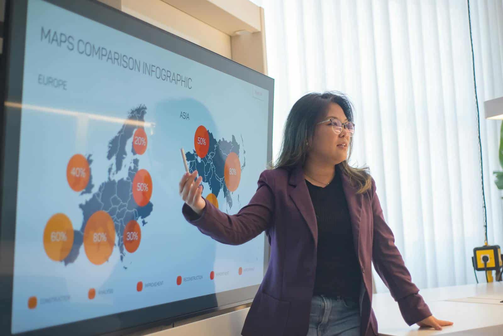
Infographics are a powerful tool for communication. You may have observed the widespread use of these eye-catching images on blogs, websites, and social media platforms. Infographics help you quickly and effectively assimilate information, by acting as a visual link between audience comprehension and complex data.
The popularity of infographics can be ascribed to the growing need for visually appealing content that effectively communicates ideas. You may notice as you browse through your feeds that infographics are not only visually appealing, but also very likely to be shared.
Can we help you generate your inforgraphic?
Click here to contact Teracore for more details >
Key Takeaways
- Infographics have become increasingly popular, due to their ability to convey complex information in a visually appealing and easily digestible format.
- Infographics enhance data visualization by presenting information in a clear and engaging way, making it easier for audiences to understand and retain the information.
- The impact of infographics is rooted in psychology. They leverage visual and cognitive processes to attract attention, evoke emotions, and facilitate information processing.
- Infographics play a crucial role in content marketing, by increasing engagement, driving traffic, and effectively communicating brand messages to target audiences.
- When creating infographics, it is important to focus on simplicity, clarity, and relevance. Use compelling visuals and storytelling techniques to effectively convey the intended message.
- Design is a critical component of infographics, as it influences the overall effectiveness and appeal of the visual content, and can significantly impact audience engagement and information retention.
- The future of infographics in data communication is promising, as advancements in technology and data visualization tools continue to expand the possibilities for creating and sharing impactful visual content.
- Successful infographics, such as those used by companies like Airbnb and Spotify, have demonstrated the power of visual storytelling in conveying complex information and making a lasting impact on audiences.
Infographics offer a means of presenting information that is both interesting and simple to comprehend. They make concepts easier to understand at a glance by integrating text, images, and data in a coherent way. The way information is presented and accessed has changed significantly as a result of this trend, making infographics a common feature online. The way infographics improve data visualization is by turning unstructured data into visually captivating stories that people are more receptive to.
Sorting through statistics and numbers can be daunting when dealing with a complex dataset. Infographics make this process easier by condensing information into easily understood images that emphasize important ideas. Infographics help you spot patterns and trends that might otherwise be lost in a sea of data by utilizing charts, graphs, and icons. Moreover, infographics cater to various learning styles. Infographics offer a well-rounded method that appeals to a wider audience, regardless of whether you are a visual learner or someone who prefers textual information.
Without having to sift through lengthy reports, you can swiftly determine relationships between data points and make conclusions. An important advantage of infographics in both professional and educational contexts, is their capacity to communicate complex information in an understandable manner. The Psychology Underpinning the Impact of Infographics Psychology is a fundamental component of infographic effectiveness.
Humans are visual beings by nature; images are processed by the brain 60,000 times faster than text. Because of this natural inclination toward visual information, your brain is more likely to interact with infographics when you see them. Text by itself might not be able to elicit feelings and establish connections like colors, shapes, and layouts. Also, infographics take advantage of cognitive biases that affect how you interpret data.
The “picture superiority effect” for example, contends that people retain images more vividly than words. The visual components of an infographic serve to reinforce the content and increase its memorability. Infographics are frequently used in educational settings because of their psychological impact; by presenting information in a manner that corresponds with your brain’s natural data processing style, they improve comprehension and retention.
The Function of Infographics in Content Marketing
Infographics are used extensively in content marketing to boost brand awareness and encourage interaction. Utilizing infographics as part of your content mix can greatly improve your outreach efforts as you experiment with different marketing strategies. In addition to drawing attention, infographics promote sharing, which can increase the visibility of your brand on social media.
Infographics help you to establish yourself as an authoritative source of information, by showcasing thoroughly investigated data and insights in an interesting manner. Increased audience trust as a result of this credibility may boost conversions and cultivate client loyalty. Using infographics in your content marketing strategy can help you stand out in the crowded digital market.
Advice for Making Great Infographics
Careful preparation and execution are necessary to produce an infographic that works. You should first identify and comprehend your target audience’s preferences. By creating an infographic that speaks to your audience, you can make sure that it will grab their interest and satisfy their needs.
Focus on choosing pertinent information to bolster your message after you have a firm grasp of your target audience. Aim for conciseness and clarity, rather than overloading viewers with information. For your infographic to be effective, design is essential. A color scheme that complements your brand and ensures readability should be chosen. Keep your fonts consistent throughout the design and choose legible ones.
Moreover, establishing visual hierarchy will help viewers navigate the content with ease. You can improve comprehension by arranging components like headings, subheadings, and icons in a deliberate manner.
The Value of Design in Infographics
The efficacy of an infographic is largely dependent on design, which goes beyond style.
In order to effectively communicate the intended message, the design components of an infographic should blend in with the content. Viewers are drawn in and encouraged to interact with the information when an infographic is well-designed. You may have come across infographics that were disorganized or visually cluttered; these kinds of designs can confuse the audience and take away from the message.
Also, the way information is interpreted can be affected by design decisions. For example, contrasting colors can draw attention to key information, and using the same iconography throughout the infographic can help to tell a coherent story. Every design element should have a purpose when you start making your own infographics, whether that purpose is to highlight important insights or improve readability. Your infographic can become a potent communication tool instead of just decoration with careful design.
The Future of Infographics in Data Communication
The function of infographics in data communication will change along with technology.
Trends like interactive infographics, which let users actively interact with the content rather than passively consuming it, may have caught your attention. In addition to improving the user experience, this interactivity offers chances for more in-depth data exploration. Innovative infographic formats should proliferate as more tools for producing dynamic visuals become accessible. Also, the creation and customization of infographics could be completely transformed by developments in machine learning and artificial intelligence. Consider having the ability to produce customized infographics, based on real-time data analysis or user preferences.
Customization to this degree may result in communication tactics that are more effective and pertinent. As you look to the future, think about how these technological developments may affect infographics and their function in successfully communicating complex information.
Examples: Effective Infographics that Created an Impact To show the potential of infographics, let’s look at a few examples that show how well they communicate ideas and encourage interaction. Information Is Beautiful’s infographic titled “The World’s Biggest Data Breaches” is a noteworthy illustration. A timeline of notable data breaches is shown in this eye-catching graphic, along with important statistics about each instance.
This infographic educated viewers and generated conversations about cybersecurity awareness by fusing interesting graphics with pertinent data. The “How Much Sleep Do You Really Need?” infographic from the National Sleep Foundation is another powerful case study. This captivating graphic uses entertaining illustrations and simple-to-read charts to break down sleep recommendations by age group.
By providing crucial details regarding sleep health in an understandable manner, this infographic connected with viewers and inspired them to put their health first. To sum up, infographics are now a vital tool for efficient communication in the digital era. They are incredibly useful tools for anyone trying to communicate complex information in a way that is memorable and easy to understand because of their capacity to improve data visualization, psychologically engage audiences, and play a significant part in content marketing.
Understanding the changing landscape and adhering to design best practices will help you maximize infographics’ potential to leave a lasting impression on your audience.
Can we help you generate your inforgraphic?
Click here to contact Teracore for more details >
FAQs
What is an infographic?
An infographic is a visual representation of information, data, or knowledge. It is designed to make complex information easy to understand and digest.
What are the benefits of using infographics?
Infographics can help to simplify complex information, make data more engaging, and improve understanding and retention of information. They are also easily shareable on social media and can help drive traffic to a website.
How are infographics created?
Infographics are created using graphic design software such as Adobe Illustrator, Canva, or Piktochart. They typically include a combination of text, images, and data visualizations.
What are some common types of infographics?
Common types of infographics include informational, statistical, process, timeline, comparison, and geographic infographics. Each type is designed to present specific types of information in a visually appealing way.
Where are infographics used?
Infographics are used in a variety of settings, including websites, social media, presentations, reports, and educational materials. They are particularly popular in content marketing and data visualization.


